Creative and Product Leader, CGD, PdM-P
Case Study
Community Natural Foods Natural Health Food Store
E-commerce Platform Switch
The objective: To improve the user experience of shopping curbside pickup/home delivery, increase e-commerce sales and increase engagement on
marketing content (recipes, articles, events).
HOW
Updated visual design, switching website platforms, better search functions, customized filters, optimizing recipe/article templates, seamless checkout process
MY ROLE
Lead Product Designer, Ideation, Interviews, Surveys, User Flows, Journey Maps,
Heat Mapping, Sketching, Wire-framing & Visual Design.
Tools: Figma, Hotjar, Adobe XD,


Background/Challenges
Every website has a story, and this website has been on so many platforms it could build a very tall building. After CNF was acquired by another company, it was decided that they would switch platforms to be on the same platforms as their parent company.
This meant that instead of having shopping and content on one website,
they would have 2 separate sites:
E-commerce site: over 7,000 products, curbside pickup (4 stores) & home delivery
Content Site: recipes, articles, events,
The challenges will be:
-
Not losing the user by adding extra steps they have to take to get to shopping site
-
Clearly differentiating the sites so users know which one they are using
-
Maintaining and/or enhancing our shop by diet or lifestyle search options


Research
Before delving deeper into the ideation process, I wanted to understand more about current website users and their challenges through various methods. And to define any pain points users are experiencing on the current website.
User Interviews: 1-on-1 interviews to gain qualitative insights into the problem.
This taught me about existing user behaviours and challenges
Employee Interviews
Stakeholder Interviews
Customer Service Interviews
Current Customer Interviews
Key Findings:
-
Employee's and customers have a hard time searching for products when using website to assist customers.
-
The product either doesn't show up in search or doesn't have an image. After some investigating, the reason for many images not showing up was because the way the product inventory worked - it doesn't show the product if product is out of stock. This is common practice amongst grocery retailers but can be confusing for customers.
-
Many customers shop by diet or lifestyle attributes, so ensuring those filters or attributes were clear and functioning on the next platform was important.
Competitor Analysis:
Looking to competitors allowed me to understand different ways some of the problems identified from User Interviews were being addressed and how I could offer an improved solution. Did market research on 3 other Natural Health e-commerce websites.
Compared website features, information hierchy, visual designs and user flow.
Heat Mapping:
Used a series of heat mapping on the homepage to understand where users are going, pin point where drop offs occur and assess efficiency of CTA's.
Key Finding: a set of heat maps placed on the homepage confirmed that people were interacting more with search vs navigation bar, interested in our store locations page, and more interested in Gluten-free and Vegan dietary icons. These findings will be used when creating a wire frame for the new homepage on shopping site.
Usability Testing:
The current site had not had any usability testing done on it, so we sent out an SUS (System Usablity Scale) Survey to all our current users and got enough responses back to formulatea usability score of 75.
Key Finding: From just user interviews alone, my hypothesis was that the usability score would be much lower. This is a good example of how testing can support (or not)
data from other research methods.
Data Analysis:
I took a deep dive into to the current website data in order to identify patterns, user behaviours and confirm or not data that came from other methods.
Google Analytics
PowerBI Reports
Website platform data
SEO partner
Digital Agency Partner
Key Finding: close to 70% of current users are on mobile. And the SEO partner found that a chunk of recipe's were not showing up in google search based on a template issue along with the fact that images did not have ALT (alternative) text.


Ideation & Design
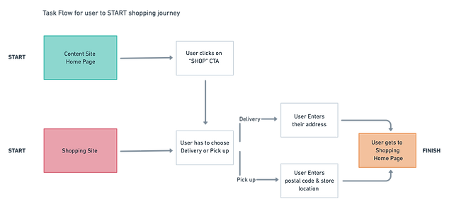
Before starting sketching or creating wire frames for home pages, I created a couple user task flows based on the above challenges users could face post re-design.
Example
After seeing the task flow, I proposed the idea of having an additional option on shopping site pop up that would give 3 options, choose: Delivery, Pickup or Learn (that would take you to our content site.) I thought this would be a more streamlined way of showing users the options they have but it was decided not to put dev time or budget into making it happen.
Task Flows
1. Start Shopping Task Flow
2. Shopping for Dietary Preferences Task Flow (Unique to our business)
Onboarding Task Flow
Even though I was not able to get the task flow to the ecommerce site as I had suggested, I was able to update the customer onboarding experience. Instead of customers having to be onboarded (choosing curbside pickup, delivery, address, sign in) then being able to view products - I delayed onboarding so the customer could view products and not be onboarded til they added a product their cart.
Final Outcomes
Through cross-functional collaboration with internal and external developers, departments between two organizations and multiple stakeholders, I led the new platform launch of the Community Natural Foods Ecommerce site. Within months of launching, I worked with store operations and launched more delivery areas for customers, including Edmonton.
Business and User Outcomes
1. 27% increased customer traffic
2. 30% increased engagement on the site
3. 18% increased conversion rate
4. 22% decreased bounce rate
5. Decrease in customer care phone calls, means less customer friction
with onboarding and shopping experience.
